Did you ever blame yourself for not using a website "the right way"? It's common to wonder why we miss things or click the wrong button if a website looks decent to the eye. The website navigation seems clear at first.
But that's often the greatest danger. The beauty of a website deceives us into thinking that our navigation troubles are our own mistake.
"The website looks great so it must be my fault. Why am I too stupid to find that replacement part?"
It's not your fault. The problem lays with the maker of the website. For one reason or another, they were unable to combine your goals with their own. In most cases, they only considered their side of the problem. Then then assume they know how their customer interacts with their website.
Since the layout and information structure makes perfect sense to the builders, it's a common issue even with bigger sites.
This articles will discuss why most website struggle with this and how you can fix it. We' focus on your navigation but you can apply the general principle on your whole website.
Forget what you know about website navigation
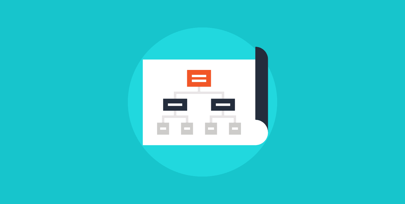
A website is a completely different informational architecture. When you're planning a new website, you are faced with the curse of knowledge.
The information about your business is structured in your mind according to what makes the most sense to you. Internal processes and even entire departments are set up for production efficiency. The stakeholders are managers and investors who are all familiar with the business.
The people visiting your website will have a gap of knowledge on what you sell. That means certain information doesn't make sense before they can understand it. How they describe their problem and what's important to them might also be in contrast to what you think is important.
Untangling this knowledge and starting at zero can be daunting because of the way we trained ourselves to think about our business.
Create and find
To illustrate the point, let's look at your website favorites on your browser.
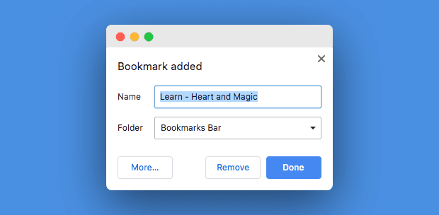
When you add them to your bookmarks in your browser, it all makes perfect sense. You scanned the article, see the layout and you can associate the header of the page with the content on the page.
You now have insider knowledge within the tiny context of the information that's in front of you. You're connected to your goals and mission. It's clear to you that the information is useful and you want to reference it later.
But as we all experienced in the past, it's hard to find the information when you need it. We're not sure where we saved it or if that information was in a word document, website or somewhere else.
The problem is our lack of context. We lost that the minute we saved our bookmark because our mind started to focus on other things again. So now, when we need the information that was so clear to us when we found it is murky at best.
That's how many website visitors feel when they are looking for their information.
Murky, at best.
Create meaning
Your bookmarks work the same way as your website navigation. The title and structure you create around them have to communicate what you can expect underneath it.
This gets tricky when we consider the gab of context between you and your customers. No matter which industry you're in, demand and offer will never see eye to eye because of their different goals.
This makes it difficult to know exactly where your customers stand. What you think is important to them might be quite low on their priority list.
They scan your navigation and wonder why you didn't put your system requirements where you put your update information. Or why you plastered your homepage with a detailed overview of your natural ingredients when all they wanted to know are your opening hours.
Placement
Our brain bases its assumptions on the information it gathered up to that point. The easier it can make a meaningful connection, the less your mind has to actively work to figure out the meaning of something.
That's what we need from our visitors. We don't want them to feel any friction between what they want from our website and understanding how to do it.
That holds true for the position of your website navigation bar as well. We need to place it exactly where they would expect it to be. The most common area would be at the top.
This can be a challenge for many creatives who see their website as an artistic expression. And we can all fall into this trap because every website starts as a blank canvas without any set rules.
Even though crazy website navigation bars look cool and unique, they lower your visitors' ability to understand your website and get to where they want to go.
Naming your items
Don't try to be clever or creative. Avoid internal lingo and restrain from any kind of SEO naming conventions in your navigation bar like "Houston personal trainer".
Google is shifting its efforts to focus on good experiences rather than keywords alone. Stuffing your navigation with your search terms will not only hurt the clarity of your website but also your ranking on Google.
You should strive for clarity and simplicity. Ask yourself which terms make sense to your visitors.

This is often a huge problem with government websites. People are looking for terms that make sense for them, not what the service is officially called.
If, for example, you want to stay in a foreign country over an extended period of time, you'll need a residence permit. However, to enter a country, you'll need a visa. Many people use those words interchangeably but they make a huge difference in the purpose.
Someone might search for "visa to stay in Germany" but what they really want is a residence permit because they already are in the country.
Our job is to make it easy for them to find the information they're looking for. That includes factoring misinformation into the design and information architecture. We are serving them and our goal is to make their lives as easy as possible.
They don't want to become experts in European law. All they want is to stay in the country.
Pushing through
Untangling the mind without a clear direction is painful. Since we don't know the mind of the customer, we can't tell when we reached our goal. It's a continuous process without clearly defined borders. It not only requires empathy but also combined thinking in structure and creativity.
You might get frustrated during the process. That's normal given the shakiness of the task. Just remember why you're going through this whole ordeal. A website needs to be usable for your customers and leads. Failure to communicate on their level is a failure in marketing.
And you don't want to fail your marketing.
We can help you with the process. An outside voice can often help to structure the process and guide you towards what really matters.